Design System: Building the future of Rakuten retail experience
Today, Rakuten counts more than 200 collaborators. From Design team to merchandising not to mention Customer services and Developers, we noticed unconsistency through user experience inbetween teams. The aim of the Rakuten Design System is to simplify component management by avoiding developping them over and over. It is also a tool to preserve brand guidelines from ton of voice to colors and enhance communication between teams.
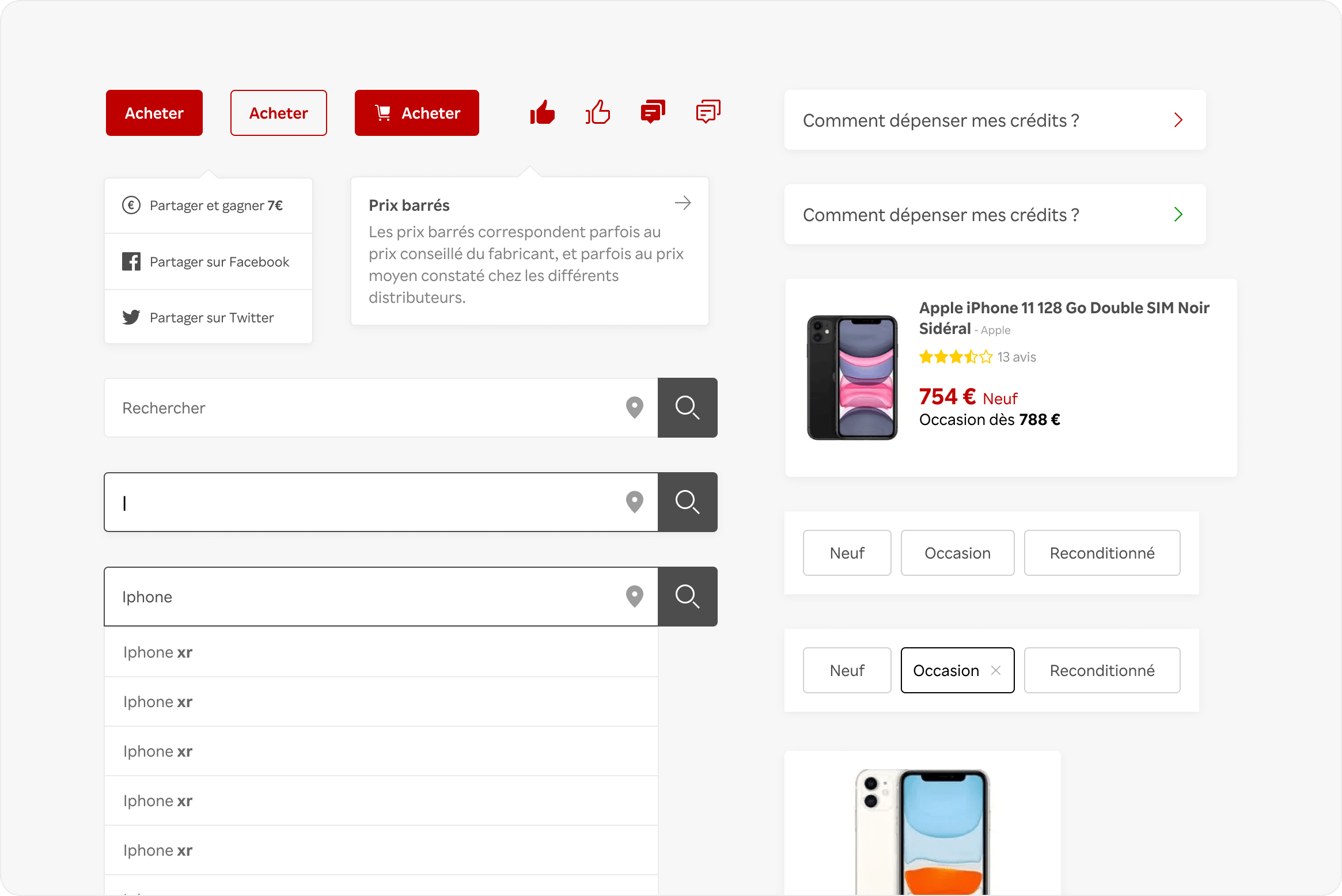
Solution
The aim of the Rakuten Design System is to simplify component management by avoiding developping them over and over. It is also a tool to preserve brand guidelines from tone of voice to colors and enhance communication between teams.
Build a library of components & guidelines for hundreds of designers, developpers,
projects leaders and PO.
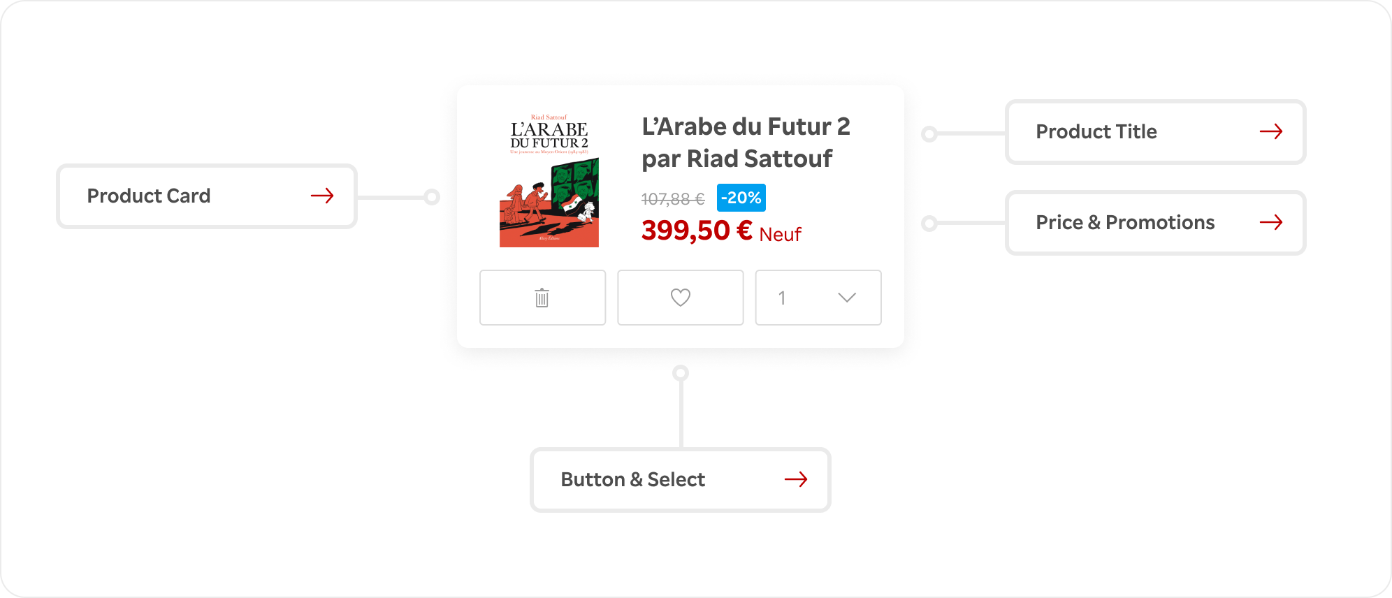
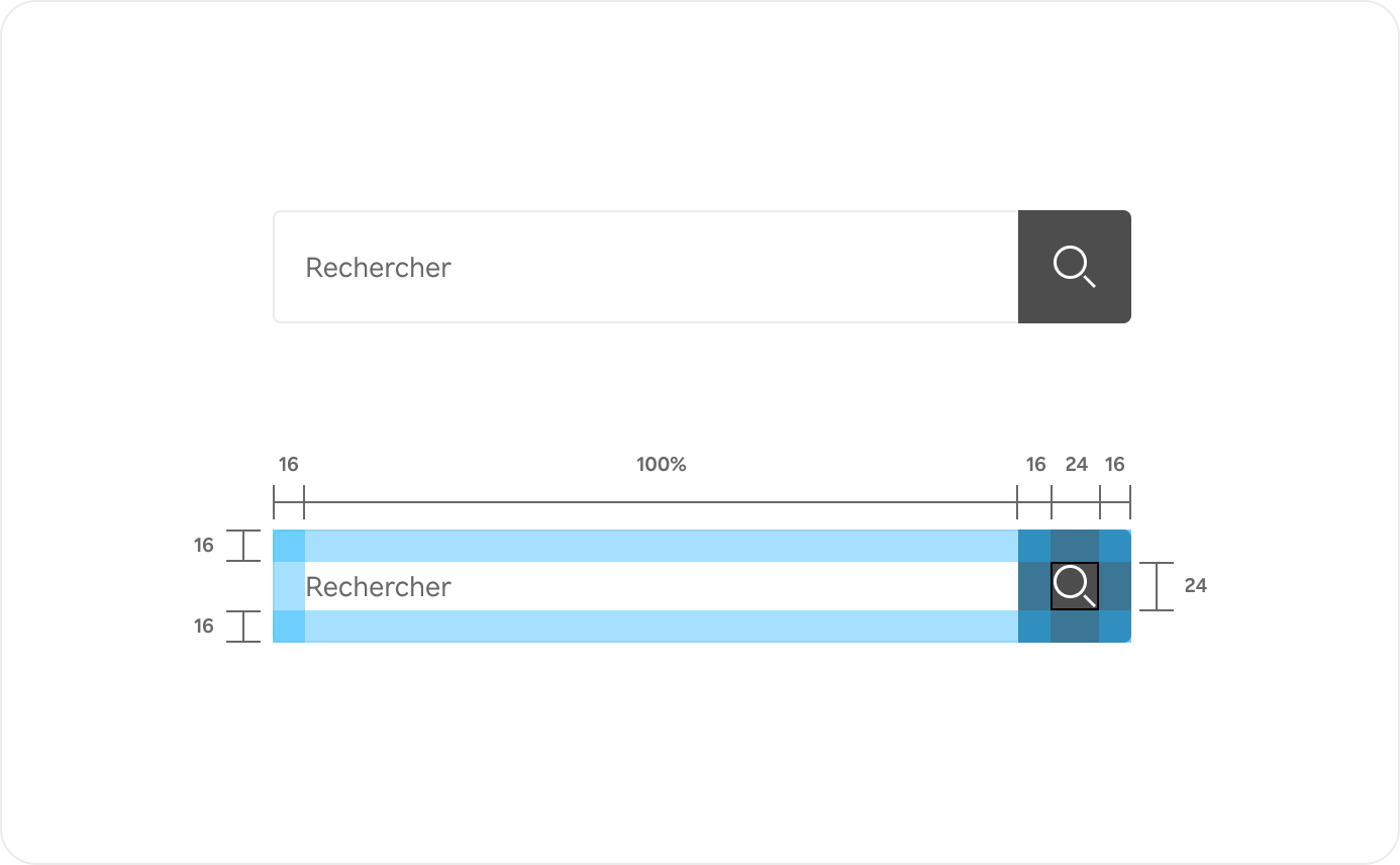
The Design system is based on an atomic design methodology. I studied Rakuten old and new interfaces to define every essential elements and layouts. It lists every components with UX/UI guidelines, Code information & Business requirements. It was a massive work of organisation, details and research around UX to create simple description and tips for everyone to use it. To make it all work, we planned weekly meeting with all teams to manage component releases.
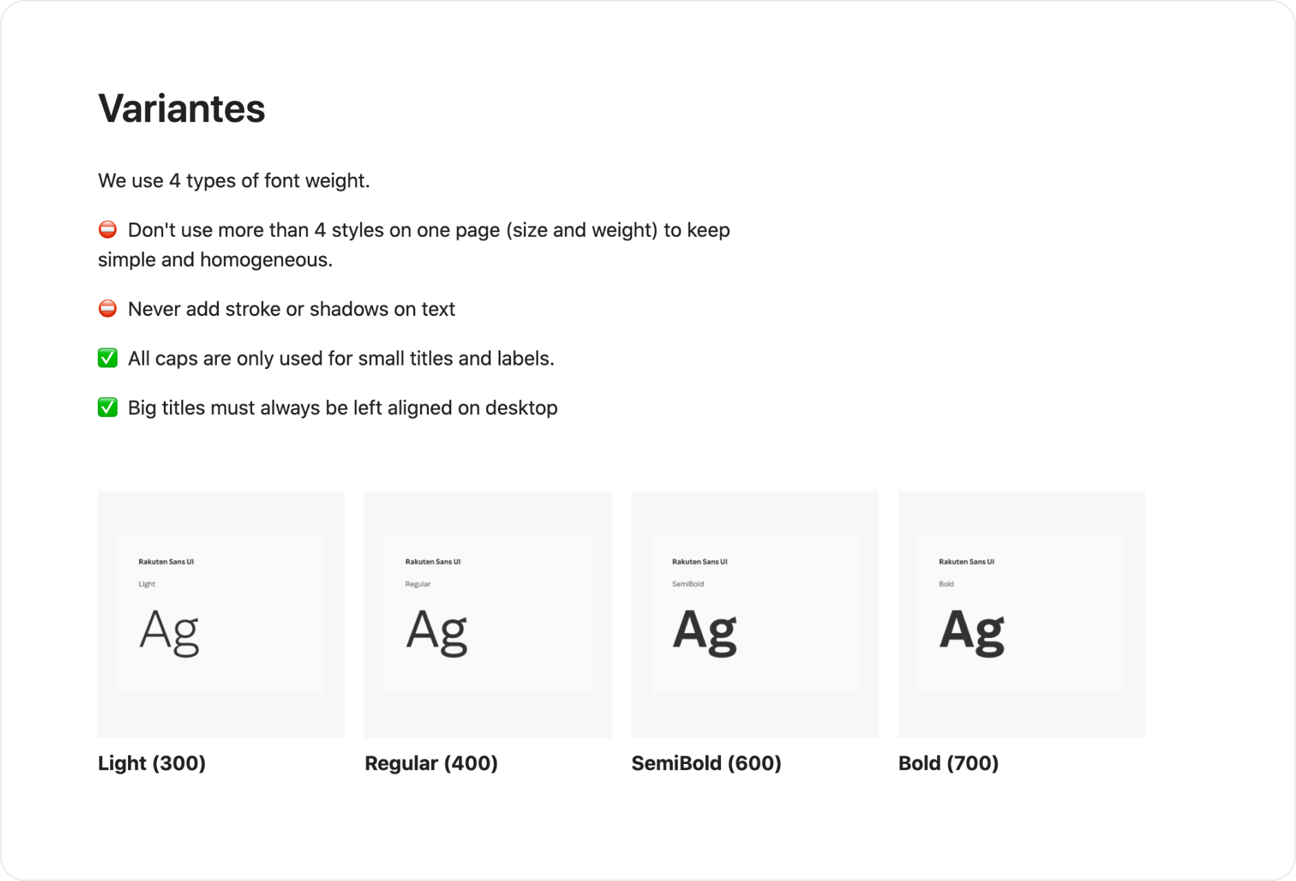
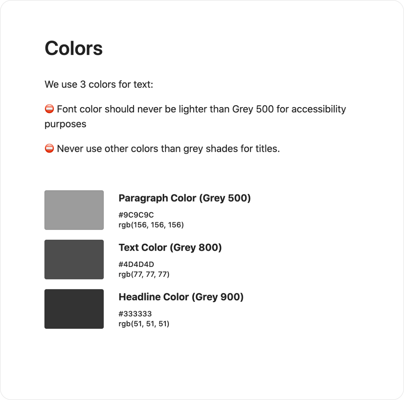
Brand guidelines
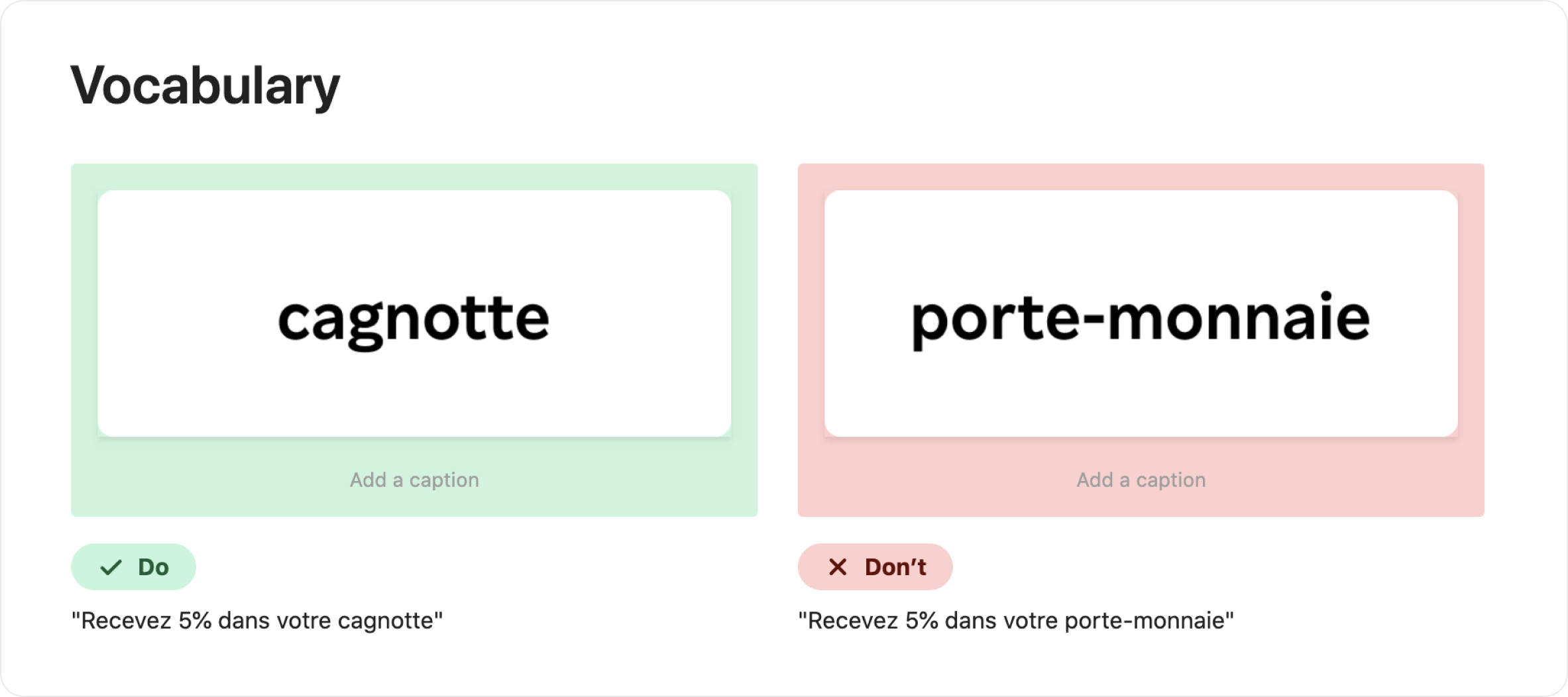
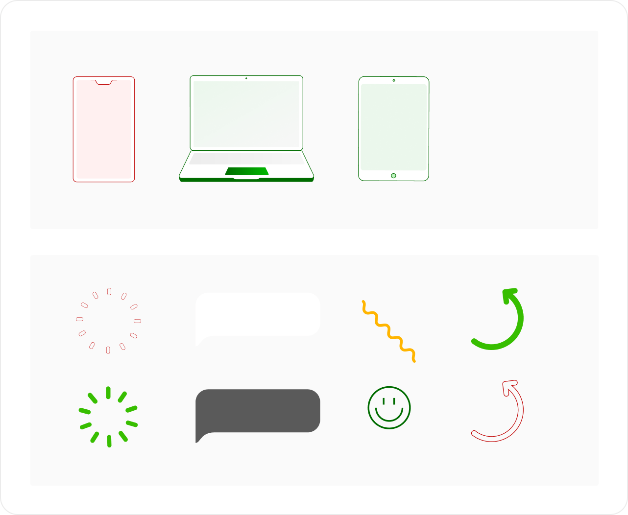
The Design System project was also dealing with making clear statements about the brand identity. We identified recurring issues to create Do and Don’ts. Creating and developping the Design System taught me how to work with other Rakuten teams to understand their needs & methodology.
Sources
NNGroup, Page Laubheimer, "Design Systems 101", April 11, 2021.
Youtube, Figma, "Build it in Figma: Create a Design System — Foundations", 2020.


